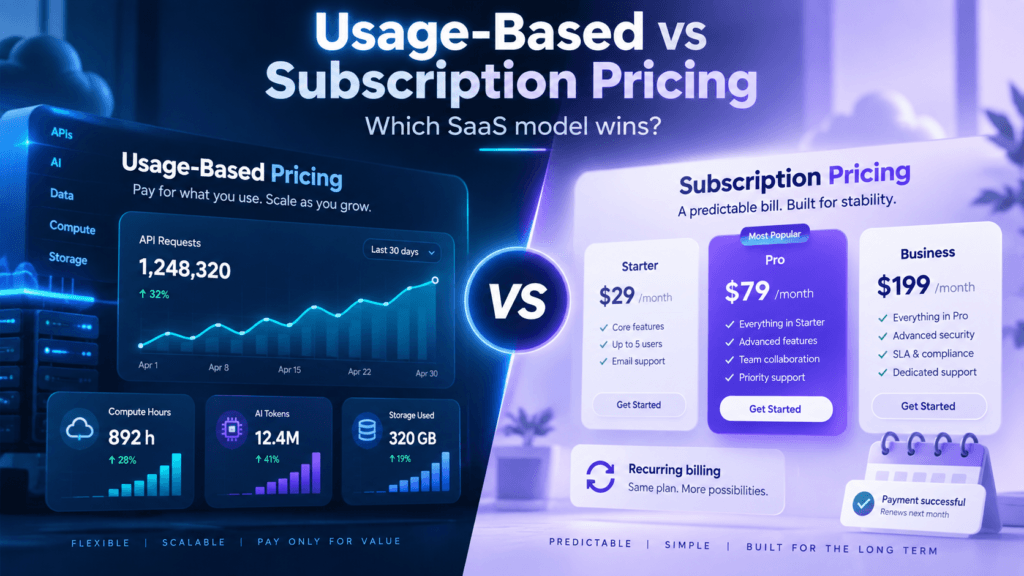

SaaS pricing page best practices matter because the pricing page sits at one of the highest-intent moments in the buying journey. Visitors who reach it are usually no longer asking whether the product exists; they are deciding whether the offer fits their needs, whether the cost feels reasonable, and what happens after they click. A strong page reduces uncertainty around plans, billing, limits, usage, annual commitments, enterprise requirements and the next step. A weak page adds friction by forcing buyers to decode feature grids, hidden conditions and unclear plan differences. Recent 2026 pricing-page research repeatedly emphasizes clear tier differentiation, transparent costs, outcome-focused copy, focused calls to action and FAQs that answer last-minute objections. The goal is not to make the page visually impressive for its own sake. The page should help the right customer identify the right plan quickly and move forward with enough confidence that pricing does not become the reason they abandon an otherwise strong product.
1. Make the Right Plan Obvious Within Seconds
The visitor should be able to understand the basic plan structure without reading every row in a comparison table. Each plan needs a clear target customer, a meaningful price difference and a simple explanation of why someone would choose it. If the page uses three or four tiers, the progression should feel natural: an entry plan for simpler needs, a core plan for the most common customer, a higher tier for greater scale or sophistication, and enterprise when the buying process genuinely changes. Current 2026 pricing-page guidance from multiple SaaS design researchers emphasizes that the pricing page should make the right option obvious rather than act like a technical specification sheet. Highlight a recommended plan only when it genuinely fits the largest attractive segment. If every plan looks equally important, or if customers must compare fifteen checkmarks before understanding the difference, the packaging itself may need simplification before design changes can improve conversion.
2. Name Plans Around Customer Identity or Progress
Plan names such as Basic, Pro and Premium communicate hierarchy but often do little to help buyers decide where they belong. More useful naming connects the tier to the customer type, maturity stage or outcome. A plan can be described as “For solo users,” “For growing teams,” or “For companies that need governance and security,” even if the formal names remain short. The page should answer “which one is for me?” before the buyer studies detailed features. This principle is especially valuable when two plans have similar capabilities but serve different organizational contexts. Use subheadings under each plan name to state the customer profile and primary outcome. Avoid overly creative names that require explanation because pricing is not the place to make the buyer decode brand language. The SaaS pricing plan names guide explains how naming can support positioning without sacrificing clarity.
3. Lead With Outcomes Before Feature Lists
Pricing-page copy should explain what the customer can accomplish before presenting a long inventory of features. Buyers care about faster workflows, more automation, stronger collaboration, better control, higher limits or enterprise governance; features are evidence that the plan can deliver those outcomes. This does not mean removing comparison tables. It means giving each plan a concise value proposition that helps the visitor understand why it exists. For example, “Automate repetitive work across your team” is more meaningful than leading with a list of API access, workflow limits and export formats. The detailed feature table can sit lower on the page for buyers who need verification. Outcome-focused copy also strengthens value-based pricing because the price is framed against what the customer gains rather than against an arbitrary bundle. When pricing feels expensive, better value communication can sometimes improve conversion more effectively than a discount.
4. Show the Real Price and Billing Commitment Clearly
Transparency is one of the strongest trust signals on a SaaS pricing page. If a plan shows “$20 per month” but requires an annual payment of $240 at checkout, state “$20/month, billed annually” beside the number. If taxes, onboarding, minimum seats, usage overages or implementation fees can materially change the bill, explain them before the customer clicks. Hiding conditions may improve one intermediate click metric while damaging checkout completion and trust. The page should distinguish the effective monthly rate from the actual charge. For enterprise pricing, it is reasonable to use “Contact Sales” when the contract genuinely depends on scale, usage or requirements, but provide context about what drives the quote. Buyers should not feel that the price is hidden simply because the vendor wants to discover their budget first. Clear commercial information improves self-qualification and reduces unnecessary sales conversations.
5. Keep the Number of Public Plans Manageable
Too many choices increase comparison effort and can make packaging differences difficult to understand. Three or four public plans are common because they support meaningful segmentation while remaining visually manageable, though there is no universal ideal number. The correct number is the number of real customer segments you can explain clearly. Do not create a fourth plan simply because a competitor has four columns. If two tiers serve almost the same buyer and differ only through one arbitrary feature gate, merging them may improve the page. Enterprise can sit outside the main self-service tiers when procurement, security, implementation and contract structure are materially different. Current 2026 pricing-page guidance consistently recommends reducing cognitive load rather than presenting every possible combination. A simpler public architecture can still support more nuanced enterprise quoting behind the scenes.
6. Use a Recommended Plan Carefully
Highlighting a recommended plan can reduce decision friction because many buyers want reassurance that they are choosing the normal option. The recommended tier should correspond to the customer segment the company genuinely wants to serve, not simply the most expensive plan that can be pushed through visual design. Explain why the plan is recommended through the value it provides. A label such as “Best for growing teams” is more informative than “Most Popular” when the claim is not supported by actual usage data. The highlighted plan should remain visually distinct without making the alternatives appear intentionally unattractive. If a lower tier is useful, let it look useful. If enterprise needs a different buying process, do not pretend the self-service recommended plan is appropriate for every organization. Good anchoring helps buyers decide; manipulative anchoring can make the page feel like a pricing trick rather than a transparent commercial offer.
7. Make Monthly vs Annual Pricing Easy to Compare
Annual billing can improve cash flow and retention, while monthly billing reduces commitment and can improve initial conversion. The pricing page should show the difference without making the math confusing. A toggle can work well if the billing frequency and savings are immediately visible, but the default state should not hide the actual annual commitment. Show both the effective monthly rate and the billed amount when necessary. If the annual discount is substantial, explain the savings in a simple way rather than forcing visitors to calculate twelve months manually. Avoid promotional language such as “two months free” unless the math is accurate. The annual discount should also be a deliberate economic choice rather than a visual convention. Our SaaS pricing discounts guide explains how to evaluate whether the longer commitment justifies the revenue given up.
8. Explain Usage Limits and Overages Before Checkout
Usage-based, credit-based and hybrid SaaS pricing needs more explanation than a fixed subscription because the customer’s total spend can change. The page should state what unit is measured, what each plan includes, what happens when the allowance is reached and whether overages are automatic, blocked or require an upgrade. If usage varies substantially, provide an estimator or example bills for light, normal and heavy customers. Do not bury important usage rules in documentation after signup. Customers should also know whether credits expire, roll over or can be purchased separately. Pricing transparency is especially important for AI because users may not naturally understand tokens or internal cost units. Where possible, translate usage into outcomes such as generations, workflows or tasks. The usage-based pricing challenges guide covers bill shock, metering and predictability in more depth.
9. Use a Comparison Table for Verification, Not Discovery
A comparison table is useful once the buyer understands the plan structure, but it should not be the only way to learn the difference between tiers. Long tables with dozens of identical checkmarks force visitors to search for the few rows that actually matter. Start with concise plan cards that communicate audience, price, core outcomes and major limits. Then use the comparison table lower on the page to verify details such as integrations, security, storage, support and administration. Group rows into meaningful categories so enterprise buyers can find governance and compliance features quickly. Emphasize differences rather than repeating every shared capability. The table should support the decision already forming in the customer’s mind rather than create the decision from scratch. If users routinely scroll back and forth between columns, the plan descriptions may not be doing enough work.
10. Match the CTA to the Buying Motion
Every plan should have a clear next action, but the call to action should reflect how that customer actually buys. A low-cost self-service plan may use “Start free,” “Start trial” or “Buy now,” while enterprise may use “Talk to Sales” or “Request a demo.” Avoid generic CTAs that do not explain what happens next. If clicking “Start free” requires a credit card, state that before the click. If enterprise requires a discovery call, make the process feel useful rather than like a barrier to learning price. The CTA copy can also reinforce the plan’s value: “Start your team workspace” is more contextual than “Submit.” Keep the number of primary actions limited. Too many secondary links, chat prompts and competing buttons can pull high-intent visitors away from the decision the page exists to support.
11. Answer Pricing Objections With Focused FAQs
Pricing-page visitors often reach the bottom with questions that determine whether they buy: Can I cancel? What happens if I exceed the limit? Is there a free trial? Can I change plans? Do you offer refunds? How does annual billing work? Is SSO included? Do you offer nonprofit or startup discounts? A focused FAQ section answers these objections without making the visitor leave the commercial flow. Current 2026 pricing-page research repeatedly recommends FAQs near the decision point because buyers arrive with uncertainty around billing and plan fit. Keep the questions genuinely relevant rather than using the section to repeat marketing copy. Link to detailed documentation when necessary, but provide enough of the answer on the page that customers can decide whether the issue affects them. Review support tickets and sales questions regularly because they reveal which objections deserve to be added or rewritten.
12. Add Social Proof That Matches the Buyer
Social proof is most effective when it reduces a specific pricing concern rather than appearing as decoration. A customer quote can demonstrate ROI, ease of implementation, reliability or the value of upgrading to a higher tier. Enterprise logos can signal trust when large buyers are considering a custom contract, while testimonials from small teams may be more relevant beside self-service plans. Avoid loading the pricing page with unrelated case-study content that distracts from the decision. Use concise proof near the point where buyers need reassurance. If a plan targets a particular segment, show evidence from customers in that segment. Quantified outcomes are especially useful when credible: time saved, workflows automated or measurable performance improvement can strengthen the value story. Pricing becomes easier to accept when buyers can see that similar customers received a result worth more than the subscription.
13. Design for Mobile Pricing Decisions
A pricing page that works on a wide desktop can become difficult on mobile if plan cards, feature tables and billing toggles collapse poorly. Mobile visitors should still be able to compare plans without horizontal scrolling through dense tables. Stack plan cards vertically, keep the most important differences visible and use expandable sections for detailed feature groups. Make sure the selected billing frequency and price remain clear as the user scrolls. Buttons should be large enough to tap, and sticky elements should not cover commercial information. Mobile traffic may convert differently from desktop depending on the product, but a poor mobile experience can still interrupt research even when the eventual purchase happens on another device. Test the page with real screen sizes and inspect whether the recommended plan remains obvious when the visual hierarchy changes.
14. Measure Activation After the Pricing Click
Pricing-page optimization should not stop at click-through rate. A plan can attract many clicks because the copy overpromises or because the cheapest option looks attractive to the wrong audience. Measure what happens after the click: signup completion, trial activation, first value, paid conversion, retention and plan changes. One 2026 pricing-page analysis makes this point explicitly by recommending that teams segment new signups by the plan clicked and evaluate how many reach first value. This helps distinguish a persuasive page from a misleading one. If one tier has strong click-through but weak activation, the plan copy may be attracting customers whose needs are not actually served. The objective is not the highest button-click rate. It is a pricing page that sends the right customers into the right product experience and creates durable revenue.
15. Treat the Pricing Page as a Living Revenue Asset
Pricing pages often become outdated because product teams add features, sales teams create new exceptions and finance changes billing rules while the public page remains untouched. Review the page whenever plans, allowances, annual discounts, enterprise requirements or pricing models change. Also perform a formal periodic audit of plan clarity, analytics, support questions and customer objections. Heatmaps, scroll behavior, exit surveys and sales feedback can reveal where visitors become confused. Test presentation changes such as plan order, copy, CTA language and comparison structure carefully. Actual price changes should be evaluated through research and customer cohorts because different prices create long-term commercial consequences that are harder to unwind than a design experiment. The pricing page should evolve alongside the monetization system rather than serving as a static brochure created during launch.
Final Verdict
A high-performing SaaS pricing page reduces uncertainty at the exact moment a customer is deciding whether to buy. Make plan differences obvious, connect each tier to a real customer, show the commercial commitment clearly, explain usage rules, use outcome-focused copy and provide a logical next action. Comparison tables, FAQs and social proof should support the decision rather than overwhelm it. Measure downstream activation and retention so page optimization does not attract the wrong customers merely to increase clicks. Most importantly, treat the pricing page as part of the pricing strategy itself. A beautiful page cannot rescue weak packaging, and strong packaging can still underperform when the page makes the offer difficult to understand. The best pricing page makes the value exchange legible: who the plan is for, what it costs, what the customer gets and why moving forward is the sensible next step.
Frequently Asked Questions
What should a SaaS pricing page include?
A strong pricing page should include clear plan names, target customers, prices, billing frequency, major outcomes, meaningful limits, primary calls to action and a path for enterprise buyers when relevant. It should also explain annual billing, usage or overage rules and plan changes. A comparison table can verify detailed features, while FAQs should answer common objections around cancellation, trials, refunds, usage and contracts. The page should help customers make a decision without requiring them to search several other pages for basic commercial information.
How many pricing tiers should SaaS have?
Three or four public plans are common, but the correct number depends on real customer segmentation. Each tier should serve a distinct customer profile or level of complexity. If two plans differ only through arbitrary feature gates, they may not both be necessary. Enterprise can sit outside the main public tiers when procurement, security and implementation are materially different. The objective is to provide enough choice to fit customers without creating so many options that comparison becomes difficult.
Should SaaS prices be public?
Self-service and lower-ACV SaaS generally benefits from public pricing because customers can qualify themselves and make decisions quickly. Enterprise products can use custom pricing when contracts depend on users, usage, implementation, security or service requirements. Even then, the pricing page should explain what drives the quote so buyers have commercial context. Hiding prices by default can create unnecessary friction when the product is otherwise standardized enough to show a clear range or starting point.
Should a pricing page highlight one plan?
Yes, when one plan genuinely fits the largest attractive customer segment. A recommended plan can reduce choice friction and help visitors identify the normal option. The highlight should be supported by a clear value reason such as “Best for growing teams” rather than an unsupported popularity claim. Do not make the other plans intentionally weak simply to force the highlighted option. Anchoring should guide customers toward fit, not manipulate them into paying more than their needs justify.
Should the pricing page show monthly or annual pricing first?
Either can work, but the billing commitment must be transparent. If annual pricing is shown as a monthly equivalent, state that the full annual amount is billed upfront. Monthly-first can reduce initial perceived commitment, while annual-first can emphasize savings and improve cash flow. Test the presentation against your buying motion rather than assuming one universal best practice. Enterprise products often use annual contracts by default, while self-service SaaS may benefit from showing both clearly.
How do you test a SaaS pricing page?
Test presentation variables such as plan order, descriptions, CTA copy, comparison structure, social proof and annual-billing presentation, then measure downstream signup and activation rather than clicks alone. Use heatmaps, scroll data, exit surveys and support questions to identify confusion. Actual price-level experiments require more care because customers can end up paying different amounts and the consequences persist beyond the test. Use customer research and cohort comparison when testing substantive pricing changes.